
2.1.4: 1585 - 1725 - Formats/design of the text
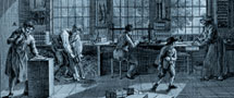
The seventeenth century is the century of the quarto: a strong book with pages wide enough to offer enough space for the somewhat plump, Baroque book decoration which was so characteristic of Dutch book production in the Golden Age. In later centuries, it would be the small formats, octavo and duodecimo, which were to become highly desirable collectors' items, while the impressive folio volumes are still the pride of every large library.
Many of the printers and publishers who were active at the beginning of the century came from the Southern Netherlands. They were strongly influenced by French examples and the quality of their publications was much better than that of their colleagues from the Northern Netherlands. The balanced, transparent pages set in roman and the beautiful ornaments and decorative letters are characteristic of these books. Such printers were to be found particularly in Leiden where they manufactured books for an international, erudite elite. The texts are mostly in Latin and occasionally in French, a language which, as the century progressed and interest moved from scientific to general cultural and historical works, became more and more important.
Books for the 'wider public', which varied from rich merchants to simple artisans, were produced in large numbers in the Republic, especially in Amsterdam where almost as many printers and publishers were active as in the rest of the Netherlands. These books do not differ in essence from their scholarly counterparts: the ornaments, decorative letters and the way in which the text is built up in chapters and paragraphs, or is provided with notes and references, have much in common. For these books in the vernacular, however, use was almost always made of a Gothic or black letter instead of roman type, giving them a completely different appearance.
The average quality of the Dutch book was, around the middle of the seventeenth century, high and would only decrease after the 1670s. The legacy of the Southern Netherlands had an unmistakable influence. There were no noteworthy differences in quality between printers during this period of growth regarding paper, composition, or items such as correction and finishing touches. The books which were produced in the provinces, however, and especially in Gelderland, Utrecht or Overijssel, were often of a lower quality. Their sloppy workmanship became the norm in Holland during the 1680s as well: poor paper, damaged and worn ornaments and decorative letters appeared more and more.
At the end of the seventeenth century, French Huguenot refugees brought about a temporary and limited revival. Important publishers such as
author: P. Dijstelberge

 |

|
|
