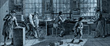
The first books printed in the Netherlands, the earliest incunabula, were almost indistinguishable from their hand-written equivalents. The texts were printed in typefaces which were imitations of the script of contemporary professional writers. Illustrations, initials, section marks, chapter titles, running titles and all other additional items which we find on the pages of fifteenth-century printed books were still applied by hand by specialists. Within a few decades, however, these elements were represented typographically. Illustrations which were originally drawn or painted in the book were replaced by woodcuts, decorative letters were cut in wood or cast in lead and printed together with the regular type. The marks to indicate a new paragraph were no longer drawn in red or blue, but were replaced by printed section marks or by white. Chapter titles, running titles and pagination gave the printed book a clear structure.
The title page, introduced in the Low Countries in the 1480s, was a new feature. The earliest printed books - like the manuscript - did not have a title page, instead, the first page of the book began with the standard opening word: incipit, 'Here begins...'. Details from the incipit and the colophon were slowly transferred to the title page.
Although smaller formats existed, there was a clear preference for the larger formats.
Most extant sixteenth-century books have a small format compared to their predecessors due to a growing but less well-to-do reading public wanting to read but unable, or unwilling, to pay for large de luxe editions. This was also, however, partly due to a new function of the printed word. In the tumultuous Low Countries of the sixteenth century, the book fulfilled to some extent a different role than in the fifteenth century: as disseminator of new ideas in the area of religion and society and as propaganda medium.
Sixteenth-century typographic design is characterised by consolidation and experiment. The components which form the type area were standardised at the beginning of the century. The structure of the title page was more or less uniform and nearly all books have running titles, marginalia, page numbers, references, catchwords and indices.
Experiments were undertaken with type faces resulting in (besides gothic, roman and italic) the civilité, a type face based on a cursive script letter taught in Dutch schools and used until well into the eighteenth century.
Many of the printers working in the Northern Netherlands at the end of the sixteenth century were refugees from the Southern Netherlands. The designs by these southerners were strongly influenced by French examples, apparent for instance in the unequivocal and well-presented page layout and the beautiful initials often showing mythological scenes. The production of the press of the Leiden town clerk Jan van Hout established in the town hall and used for official publications was exceptional. All work from his press has been composed with an elegant civilité.