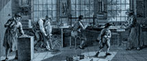
The first books printed in the Low Countries with movable type, initially attributed to the fictitious Laurens Jansz. Coster, are now dated around 1465, a decade after Gutenberg. Only a handful of the earliest printers in the Netherlands cut their own type and there was probably not yet an established trade in founts or matrices. Each printer, therefore, arranged for his own type to be made by, for example, a goldsmith or other metal worker. There is no evidence that the earliest techniques differed much from what we know from around 1500 and remained usual until around 1840: type was cast in an adjustable mould with interchangeable copper matrices which were struck using steel punches. Some printers acquired matrices, others only founts.
From 1473 onwards, we know a number of printing workshops in the Low Countries by name. Most of them imported their type (probably in the form of matrices) from Cologne, Venice and Basle, apparently important trading centres in this field. An occasional punch cutter even came to the Low Countries from these centres. During the following decades a single type was sometimes used in three or four printing houses but most were (in the Low Countries) characteristic for only a single workplace. A strong domestic trade flourished in the 1480s. In 1492, Henric Lettersnider cut a textura which by the end of the fifteenth century was already in use in nine printing houses, and in dozens more in the decades to come. This textura was therefore one of the most successful types of all time. A dozen sets of matrices for the most popular letters were struck from a single set of punches and one set of matrices could be used for decades by various printers.
Almost all fifteenth-century printing types were of the textura style or, less often, rotunda. The textura by Lettersnider laid the basis for the Dutch style and was quickly imitated. In the decades after 1520, more and more competition developed from texturas cast in matrices originating from France. The civilité letter enjoyed a short period of popularity from 1560 onwards.
Up until 1539 only a few printers used roman type. In that year, the punchcutter, type founder and printer, Joos Lambrecht, argued for its use. In the following twenty to thirty years, François Guyot and Ameet Tavernier cut the majority of romans and italics used (predominantly in scholarly works in Latin) and it is thanks to them that the Low Countries became one of the major exporters. Christopher Plantin bought regularly from these suppliers but after 1560 he obtained founts and matrices for better romans and italics manufactured by French masters such as Claude Garamond, Robert Granjon and Pierre Haultin. These types spread rapidly among other printers.
Plantin was also the major customer of Hendrik van den Keere, the best and most influential punchcutter in the Low Countries in the sixteenth century. He cut various texturas around 1570 and romans around 1575 in the French style. His premature death in 1580 left the Low Countries without a significant punchcutter for thirty years, and the new types of the seventeenth century were to be strongly influenced by his.