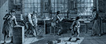
The transition from Art Nouveau book art to modern book design with attention to micro-typography is largely the work of S.H. de Roos. From 1907 onwards, his publicity material for Lettergieterij 'Amsterdam' voorheen N. Tetterode served as composition models for many printing houses. There was also some marginal activity by the private presses; the best-known private printer was undoubtedly J.F. van Royen.
In the late 1910s, artists and architects such as Theo van Doesburg and H.Th. Wijdeveld turned their hands to graphic design. There were, for instance, experiments in De stijl and Wendingen. For some time, the decorative 'Wendingen' style was followed extensively by many compositors. The New Typography, at first mostly used in advertising, had a large influence in ordinary-books design. It embraced new techniques and materials ('machines aesthetics') as well as propagating the normalisation of paper formats (DIN sizes). The designs were preferably asymmetrical, with a central role for photography. The Dutch pioneers included Piet Zwart, Paul Schuitema and Gerard Kiljan. In 1930, the latter established the first course in graphic design at the Academy in The Hague. The ideas of the New Typography also spread throughout the printing companies via Jan Tschichold's manual Typografische vormgeving (1938). H.N. Werkman, who worked alone, produced work from 1923 onwards and was later to become an influential avant-garde designer.
Jan van Krimpen, an employee of Joh. Enschedé en Zonen took over De Roos' leading role as book designer (and type designer) in the late twenties. He was in favour of reticent, classic book typography such as that advocated by Stanley Morison. In the period before the Second World War, besides De Roos and Van Krimpen, J.B. Heukelom, Charles Nypels, A.A.M. Stols and the German emigrant Henri Friedlaender were also active as book designers.
After the war, the profession of independent designer really began to take off. The role of the printer became increasingly limited to one of production only. The trade association GKf, in which the graphic designers began to play a significant role, was founded in 1945 with museum director and designer Willem Sandberg as its chairman. The classic, text-oriented typography maintained itself for literature and academic publications. In contrast to, for instance, jubilee books and annual reports, the design budget for these genres is limited. The contribution by book designers such as Helmut Salden and Harry N. Sierman was therefore often limited to the cover or dust jacket. With his Boek over het maken van boeken (Book on the making of books) (1966), H. van Krimpen wrote the traditionalists' manual.
At the end of the 1930s, young designers had already been looking for a freer approach to the New Typography with Dick Elffers as the most prominent among them. After the war, he and other 'progressives' of the second generation designed many photo books. In the late fifties, the objective, systematic Swiss typography found its Dutch exponent in Wim Crouwel, who became known for his museum catalogues. A more committed side of historic modernism was to be found in the work of Jan van Toorn.
In the eighties and nineties, Dutch graphic design caused an international stir with its anarchy and pluriformity (Anthon Beeke, Studio Dumbar, Hard Werken). In comparison, Walter Nikkels' art catalogues, in which white plays a prominent role, seem almost serene. Like his contemporary Karel Martens, he designed well-considered books in the modernist tradition. In the eighties and nineties, Irma Boom also experimented with the book as object in prestigious (company) publications.