Format indications which, until the 1830s, were usually based on the way in which sheets of paper were folded, slowly but surely lost their original meaning during this period. As the mechanisation of the printing process and the production of machine-made paper in all sorts of formats increased, the names for the formats came to be based on the size of a book. Quarto and folio were used less and less while octavo became the most popular format in various sizes related to the nature of the work: royal octavo and imperial octavo for de luxe editions and illustrated editions, large and small median-octavo or post-octavo for academic publications, novels, collections of poetry, biographies, travelogues and for secondary school textbooks, small octavo for primary schoolbooks, travel guides and popular editions. Diversification in the types of books was aimed at the purchasing power of various groups: from simple editions intended for the less prosperous to lavish editions for the more critical and wealthier public.
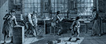
A noticeable change in the form was the fact that letter/number marking of the gathering was replaced by numbering and limited to the recto side of the first leaf. Many books were printed in didonic, the most popular book type of the nineteenth century. The Gothic black letter remained in use until well into the century in the church books of the orthodox Protestants and also in chapbooks. Title pages with their sometimes lengthy titles, generally made lavish use of different types. It was the printer, perhaps in conjunction with the publisher, who decided the design of the book (the size of the type area, compressed or spaced print, type family and body size) to match the format, target group and the use of the book. One of the few known printers for their fine typographical print work was the book printer C.A. Spin & Co., who was the best, but also the most expensive, in Amsterdam. All the major nineteenth-century publishers had work printed by this firm.
The second half of the nineteenth century was characterised by an aesthetic change in design which in fact covered the whole field of arts and crafts. The production of type and paper by machines ensured an ever more uniform presentation, although new illustrative techniques ensured that more and more illustrated periodicals appeared on the market. The design of books was limited to imitation and there was no hint of a real, creative artistic élan. An inspiring example of innovation in the art of printing was the Englishman William Morris (1834-1896) who, with the products of the Kelmscott Press, which was established in 1890, brought about a revival of the lost aesthetics in the appearance of books. People such as A.J. Derkinderen, A. Diepenbrock, H.P. Berlage and B. Zweers joined forces in Vondel's Gijsbreght (1894-1901), a monument of collective struggle for changes in the art of printing books. The 1894 translation of Walter Crane's The claims of decorative art (1892) by Jan Veth (title: Kunst en samenleving) also had an enormous influence on the 'Nieuwe Kunst' (Dutch Art Nouveau) movement. A number of figures (among others G.W. Dijsselhof, C.A. Lion Cachet, Theo Nieuwenhuis) came from the world of the visual arts. They sought innovation particularly in the 'decoration' of books and bindings where floral designs and stylisation were especially predominant. In addition to these embellishers, there was a group of typographers (among whom Berend Modderman, Sjoerd Hendrik de Roos, J.W. Enschedé) who had their roots the printing trade. They focused on new types and modern make-up for printed materials. The two movements existed alongside one another, although in the early decades of the twentieth century, the decorative movement had to give way to rationalists or typographers.