A remarkably large number of type foundries started up during the initial decades of this period. The most important were: in Amsterdam Elix & Co. (1837) and De Passe & Menne (1841), in Breda Broese & Comp. (1837), in Groningen Oomkens, Van Bakkenes & Damsté (1843) and Onnes, De Boer & Coers (1857), in Rotterdam N. Tetterode (1851) and in Arnhem G.W. van der Wiel (1855?). They all had the firm of Joh. Enschedé & Zonen of Haarlem as a major (domestic) competitor.
The most significant newcomer turned out to be N. Tetterode. This firm had taken over the foundry of Broese & Comp. including its personnel. Broese & Comp., however, continued its other activities and its printing shop. Type founders, moreover, were usually active in different branches of the graphic industry. Thus Enschedé had printed, among other things, Dutch money since 1814 and Tetterode furnished complete printing houses.
In the first half of the nineteenth century, black letter was only used to a limited extent: for bibles, hymnbooks, school books and also popular literature. New types were developed in this period, especially in England, of which the sanserif and the egyptian were to gain a lasting place. Also typical of the nineteenth century were the large, often exuberant, ornamented typefaces for posters which became popular in England in the 1820s. Matrices for new Latin text founts, mostly didones, usually came from abroad. When, in the 1840s, it became possible to copy the types belonging to competitors electrolytically, Dutch foundries shied away from designing and developing their own. These were, after all, not protected by copyright and the competition could, therefore, easily profit from the large investments required for the production of such type. Enschedé and Tetterode did still cut types such as Javanese, Batak and Chinese. The well-known printing firm of E.J. Brill in Leiden specialised in the composition of non-Latin faces.
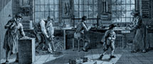
Machines gradually replaced casting by hand. Enschedé bought the first type-casting machine in 1846 in Germany but it did not meet expectations. A completely different kind of 'casting machine' was, from the 1890s, to become an increasing threat to the foundries: the Linotype (= line of type). This apparatus could cast fixed lines of text and was extremely suitable for composing newspapers, magazines and books. In this way the type foundries' market for body types crumbled away. They were forced to devote themselves to the development of fashionable display types, fleurons and other decorative material.
By around 1900 nearly all Dutch foundries had been bought up by Enschedé or the Lettergieterij 'Amsterdam' voorheen N. Tetterode (LA), as the firm had been called since 1901. The latter was clearly more modern than Enschedé. In 1906, for example, LA released the internationally successful Cheltenham, a text type that had been put on the market in America a few years earlier. The Amsterdam firm made a good move in 1907 by taking on the decorative artist S.H. de Roos as an artistic employee. De Roos, inspired at the beginning of his career by William Morris, was to play a dominant role as typographer, type designer and professional author. His first major type for LA was the 'Nieuw Javaans' (New Javanese) (1909).