
2.1.1: 1585 - 1725 - Introduction
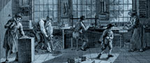
The book as a physical object has been less well studied for the period 1585-1725 than for the period preceding it: on the one hand there was less need for this because the identification of the edition was less difficult and, on the other hand, there was more than enough material (editions, typefaces, paper). It was in this period that the form of the object 'book' developed the characteristics which can still be recognised in the modern book. Quarto dominated as far as format was concerned although large reference works retained their folio format; all kinds of text, including the classics, were printed in convenient small formats (duodecimo and smaller). Among the typefaces, roman definitely became the dominant one, although the Gothic black letter (textura, often called the 'Duitse (i.e. Dutch) letter') was used for certain Dutch-language genres although interspersed with text in roman and italics (hymnbooks, travelogues, descriptions of cities or countries, pamphlets, schoolbooks). Type production in the Netherlands was highly appreciated and our type foundries exported to, among other places, England. On the other hand, domestic paper production started quite late: until 1685 (revocation of the Edict of Nantes), a well-organised import trade in French paper of excellent quality had existed. Book illustrations reached a high point: copper engravings appeared in nearly every genre (especially hymnbooks and emblem books); frontispieces also flourished (which came before, or in place of, the title page). The binding was not part of the actual production process(usually carried out by order of the individual buyer); the simple vellum binding predominated, followed by bindings in calf with or without gold tooling.
author: F.A. Janssen

 |
|
|||||||||||||
|
|||||||||||||
|
|||||||||||||
|

|
|
